


- Top
- Introducing the Collection
- Products
Introducing the Collection
 Products
-
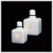
Shiseido Euderline
1897Euderline was the first cosmetic product created by Fukuhara Arinobu, who had earlier founded Shiseido as Japan's first Western-style pharmacy. It was formulated based on the most advanced Western pharmacological technology available at the time. The name Euderline was also novel for the time, taken from Greek words meaning “good” (eu) and “skin” (derma). The “red wine” appearance of the lotion earned it the nickname “Shiseido red water” among users. The delicate bottle with its large rounded stopper was noted early on for its fine workmanship.
-
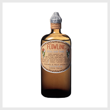
Shiseido Flowline
1915The management of Shiseido was continued on by Fukuhara Shinzo, who applied the knowledge and experience gained while studying abroad to the development of Flowline hair tonic. Its elliptical bottle and label printed in roman characters decorated with camellia blossoms gave a distinctly Western impression. The classic Japanese women's low pompadour hairstyle (a form of bun) that became popular around the turn of the century spread widely during the early 1900s, and the release of Flowline coincided with this. The high quality of this product as a hair oil and tonic is clear from the fact that it later received four patents.
-
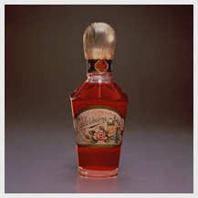
Hanatsubaki Perfume
1917Shiseido's first perfume, Hanatsubaki, was created in the image of the camellia blossom, the actual flower of which in fact has little distinct fragrance of its own. The weightiness of this perfume's formula harmonizing with its sweetish fragrance made it an ideal for people with Asian tastes. The bottle design took clues from the Modernism popular at the time, but integrated a depth and weight with a Japanese feeling. The top of the stopper was decorated with flowers in engraved relief. This is the perfume that became the origin of all subsequent Shiseido fragrances.
-
Rainbow Color Face Powders
1917In an age when face powders were primarily white only, Shiseido launched this rainbow series (which included white, yellow, flesh, rose, peony, green, and purple shades), the first such product in Japan to enable users to match their face powder shade to their attire. While the containers for face powders had typically been round or square, these were packaged in novel square boxes whose cut-off corners gave them eight sides, each decorated with Shiseido's camellia blossom logo inside a border and the top designed with a gentle bulge. This well-implemented design—and the originality of the colors inside—earned these products considerable appreciation.
-
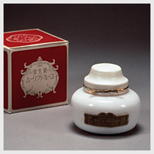
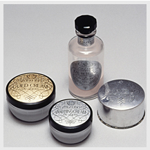
Shiseido Cold Cream
1918Among the products sold by Shiseido, Fukuhara Shinzo was particularly proud of the high quality of the cold cream the company released in 1918. The container was a squat white bottle with a friction-fit lid covered in a thin film tied with a golden string. The label was printed in gold with a raised design and lettering. In 1928 a red outer box designed by Maeda Mitsugu was added, garnering the product the nickname “red box cream.”
-
Perfume Kiku (Chrysanthemum)
Around 1920Formulated on natural chrysanthemum blossoms, Kiku represented a quintessentially Japanese fragrance. Its simple bottle design featured shoulders sloping down gently from the opening at the top, cut off sharply at the bottom. The stopper top was a glass sphere, hollow within. The flower design on the bottle was set directly into the surface. The outer box was decorated in gold, muted with an overlay of hemp mesh to lend the whole an elegantly diaphanous appearance.
-
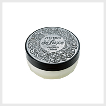
Deluxe
1932One of the most luxury pre-war brands. Even the materials for the container were carefully selected, and the bottles used beaded glass. The package design by Maeda Mitsugu is a perfect example of traditional arabesque motifs refined into a modern look. With its foundations in Western design, the Shiseido design department attempted in many ways to integrate arabesque patterns into its work, and this piece represents one step along that path.
-
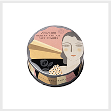
Shiseido Modern Color
Face Powder
1932The “modern girls” of this era dressed in the latest fashions as they strolled the avenues of Ginza. Wave-permed hair, lips colored like flower petals, slender chins, and egg-shaped visages. Designer Yamana Ayao created image after image of this new generation of women, but this depiction of one on Modern Color Face Powder is a rare example. Showing a beautiful harmony of Art Nouveau and Art Deco elements, this design was very representative of the pre-war Shiseido packaging aesthetic.
-
Shiseido Toothpaste
1947During the lean war years, containers were often made of cheaper materials like paper, tin, or ceramics, and this continued even after the war as Japan regained its footing. This is one product from that era, bearing the Shiseido name and trademark camellia flower depicted in light blue glaze in a very simple but refreshing design.
-
Deluxe
1951By 1951 Japan's economy was beginning to recover, and with it so was Shiseido's “Deluxe” flagship brand. Designer Yamana Ayao took up the challenge of revamping Maeda Mitsugu's earlier pre-war calligraphic designs, integrating French rococo tones to create a completely new and more decorative version of Shiseido's trademark arabesques. While this design aspect was thus revised, the packaging shape still carried on the earlier sense of refined elegance.
-
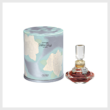
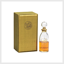
White Rose Natural Perfume
1954While most rose-scented perfumes incorporate pink blossoms, this luxury perfume—a recreation of an earlier 1936 product—was made from the essence of naturally white Bulgarian roses. In an age when the average starting pay for a college graduate was less than ¥10,000, the design of each ¥18,000 bottle was made of elegant finely hand-crafted cut crystal with a shape reminiscent of a beautifully blossoming flower. The outer box featured luminous, airy depictions of white roses blooming in a morning haze.
-
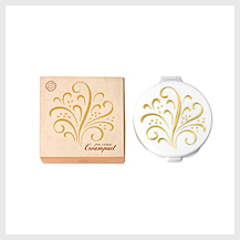
Shiseido Cream Compact
1960This oil-based face powder formulated to glide smoothly over the skin to give a natural-looking beauty came in a conveniently portable small compact, ideal for making quick, easy touch-ups throughout the day and evening. The luxurious packaging design featured a white container engraved with elegantly scrolling gold Shiseido arabesques.
-
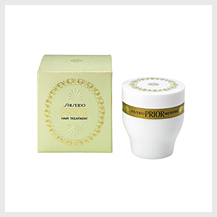
Prior
1961Prior was a luxury skin care and hair care brand developed to replace the Deluxe brand during the boom years of the late 1950s and early 1960s. The packaging tinted in white and beige was conceived to de-emphasize ornamentation in favor of a slightly more stoic aesthetic, a new image that contrasted with the showy opulence of Deluxe. The distinctive arabesques were the work of designer Yamana Ayao.
-
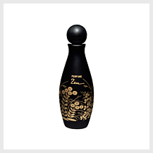
Zen Perfume
1964The Tokyo Olympics stirred a resurgence of interest in Japanese taste in the West, and Shiseido began developing cosmetics oriented to these overseas markets. Among these was the fragrance Zen, named for a religious philosophy well known in the West and often associated with the essence of Japanese culture. The bottle's understated black lacquer background and gilded images of autumn fields and gardens (based on motifs found at Kodai temple) were designed to evoke a mysterious sense of Oriental subtlety and profundity.
-
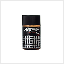
MG5
1967The design of this product package overturned the usual rule for men's cosmetics of using a larger bottle with a smaller cap, and instead made both the same diameter, a novel and easy to use shape. This was decorated with a monotone checkered diamond pattern in black and silver, conveying a sense of cleanness and speed appealing to the sensibilities of young people at the time. The name was based on “M” for modern, “G” for gentleman, and “5” for the five notable features the product offered.
-
Inoui
1977Inoui was released with the vivid message: “It's not her that's beautiful; it's how she lives her life that's beautiful.” For this product Shiseido paired with an American design company to come up with an unprecedented design, one well suited to women of refined international sensibilities and particular about performance and usability. The slim, sleek containers were designed to target the contemporary career woman.
-
Tactics
1978The Tactics brand was created with the intention of getting men to integrate fragrances into their personal grooming. Created in collaboration with a British design house, the result was an innovative image somewhat apart from the usual Shiseido sensibility. The unique square bottle was designed to look like Chinese white porcelain, offering a clean presence, and the “T” integrated into the graphic design offered an image appealing to the intellectual man.
-
Natsuko
1979This advanced compact face powder could be applied wet or dry. The quick, easy beauty finishing it offered made it hugely appealing among women and it became a major hit. Intended to evoke an image of “an urban summer,” the design featured a translucent red ring around a pure white body in a square with two-tier internal structure. It aimed to bring a refreshed sense of novelty to users through repetition of opening and closing the compact of such simple shape.
-
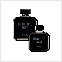
Nombre Noir
1982Nombre Noir was a fragrance that used perfume maker Serge Lutens as image creator. Lutens' idea was that black is the ultimate color because it concentrates all other colors, and so the design was based entirely on black. Both cap and glass bottle were black, the latter sandblast etched with the lettering, creating a contrast between gloss and matte areas that highlighted the appeal of black to the very core.
-
Angelic
1991Based on the themes of “freedom” and “expansiveness,” French perfumer Jean-Louis Sieuzac was responsible for blending this floriental fragrance. As its visual symbol it used an angel image by Andy Worhol. The bottle used gold as its key color, with a mosque-like shape featuring lines drawing upward from earth to sky.
-
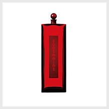
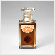
Eudermine Global
1997To celebrate Shiseido's 100 years as a cosmetics maker, the company re-released its very first product, Eudermine, in an all new form. The design was symbolic of taking Shiseido's beauty philosophy into the 21st century. Elements included the well known Eudermine red color, an extreme reduction of excess elements, and the tall, slender, simple shape stretching upwards like a piece of architecture. The logo on the label had the letters mirrored left and right, turning them into graphic symbols.
-
Untied
1997Untied was a men's skin care brand developed in collaboration with Italian creator Sergio Cutrone. It featured a bottle cut at unusual angles like a modern architectural structure, such that the silhouette changed endlessly depending on the angle of view, the same form seemingly never repeated. This form also made the bottles fit comfortably in the hand for easy use.
-
Vocalise
1997This fragrance was developed on the key phrase “in praise of contradiction,” which spoke to the idea of simply embracing and expressing the many contradictions inherent in the human heart. From the front the bottle seemed a simple circle, but with a ridge line full of waverings. Changing the angle of view brought the two contradictory elements of “fineness” and “strength” into view in marked contrast. The perfume was blended by French perfumer Jacques Cavallier.
-
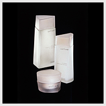
Quiora
1998The Quiora line of cosmetics was developed with attention to how fragrance affects both the spirit and the skin. The willowy form of the bottle is reminiscent of natural plants, and the matte blue lends a sense of calm, both fragrance and packaging mindful of their influence on both spirit and skin.
-
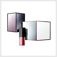
Maquillage
2005Maquillage was created to go beyond the limits of base makeup versus point makeup to offer a total makeup brand. Taking a cue from the Art Deco philosophy of integrating both beauty and function into everyday life, its design aimed to achieve functionality and elegance throughout. In particular, the eye color cases created around a “mirrored box” theme eliminated excess of form, featured large mirrors, and were designed for detail, even down to the sound when opened and closed.
-

Future Solutions LX
2009Future Solutions LX is a globally oriented luxury skin care brand. Its design including nuanced black and mysteriously glittering gold coloring, as well as forms comprised of delicate curvatures, give a decisively modern impression, and the camellia blossom etched into the center of the cap speaks conspicuously to the fact that the brand is of a premium line. The name is expressive of the brand's promise to offer women a future of beauty.